Why Responsive Design is the King of SEO: A Deep Dive into Screen Resolution Simulation
The Evolution of the Mobile Web
We no longer live in a world where everyone browses the web on a standard desktop. Today, users access your site from smartwatches, foldable phones, tablets, and massive 5K monitors. This diversity makes a Screen Resolution Simulator an indispensable tool for every webmaster and digital marketer.
Google’s Mobile-First Indexing & Core Web Vitals
Since 2020, Google has primarily used the mobile version of a site for indexing and ranking. If your website looks "broken" on a small screen, Google will automatically lower your rank, even if your content is amazing. Furthermore, Google's "Core Web Vitals" now measure "Visual Stability." If your layout shifts when viewed on a different resolution, it could negatively impact your SEO performance.
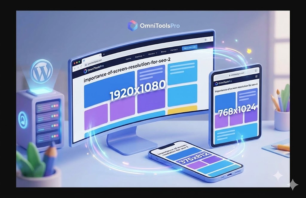
What is a Screen Resolution Simulator?
It is a sophisticated tool that allows you to see your website exactly as it appears on different devices without needing to own dozens of physical gadgets. It simulates the "viewport size," allowing you to check if your buttons are clickable, your text is readable, and your images are properly aligned. This is not just about aesthetics; it is about functionality.
The Difference Between Screen Size and Resolution
Many beginners confuse screen size (inches) with resolution (pixels). A small phone can have a very high resolution (like an iPhone Retina display), while a large monitor might have a lower density. Our Screen Resolution Simulator helps you navigate these technical differences by providing presets for the most common devices used globally.
Key Metrics to Watch During Your Simulation Testing:
Visual Hierarchy: Does the most important information (like your Call-to-Action buttons) stay "above the fold" on mobile devices?
Touch Targets: Are your links and buttons large enough for a thumb to click comfortably without hitting the wrong link?
Readability: Is your font size consistent? Text that is too small to read on a mobile screen is a major reason for high bounce rates.
Layout Breakpoints: Check if your CSS media queries are working correctly. At what point does your sidebar move below the main content?
The Impact on User Experience (UX) and Conversions
User experience is a direct ranking factor. High bounce rates (users leaving your site immediately) often happen because a site is difficult to navigate on a specific resolution. If a user can't find the "Buy" or "Subscribe" button because it’s hidden off-screen, you lose money. By using our simulator, you ensure that every visitor, regardless of their device, has a seamless and professional experience.
Common Pitfalls in Mobile Responsiveness Even with modern frameworks like Bootstrap or Tailwind, errors can occur. A common mistake is using fixed widths (like
width: 600px;) instead of relative widths (likewidth: 100%;). When a user visits such a page on a mobile device with a 375px resolution, the content will overflow, forcing the user to scroll horizontally—a major SEO "red flag." By using the Screen Resolution Simulator, you can quickly catch these overflow issues and ensure your CSS "Media Queries" are triggering at the correct breakpoints.Conclusion:
The Future of Screen Resolution in 2026 As foldable phones and ultra-wide curved monitors become the norm, the complexity of web design increases. We are moving towards "Fluid Design" where the layout adapts not just to the device type, but to the specific pixel density (DPI). Monitoring how your high-resolution images scale without slowing down the page load speed is essential. Fast loading times combined with perfect resolution scaling are the two pillars that will keep your site at the top of Google’s Search Engine Results Pages (SERPs).